Layout block
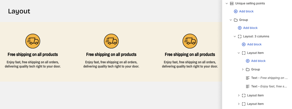
Layout blocks allow you to organize content using different layout types:
- Grid - Arrange items in a responsive grid pattern
- Carousel - Display items in a sliding/scrolling format
- Masonry - Create a Pinterest-style staggered layout
- Custom layouts - Use special layouts unique to this theme
Layout basic settings
Grid Layout
1. Number of Columns
- Device settings: Configure separate column counts for desktop and mobile
- Desktop: Adjust from 1 to 12 columns
- Mobile: Adjust from 1 to 12 columns
- Use the slider to set your desired number of columns
2. Gap Between Items
- Global: Use the gap settings from theme settings (column gap and row gap)
- Custom: Set a custom spacing from 0 to 100px for this block only
3. Grid Width
- Fill: Grid width matches the container width
- Custom: Set a specific max-width (cannot exceed the container's max-width)
4. Row Height
- Auto: Automatically adjusts to fit content
- Fixed: Set a fixed height using the formula: height = value × 1rem
5. Padding
- Padding: Adjust spacing for Top, Bottom, Left, and Right sides
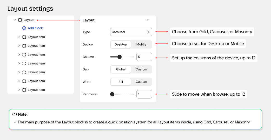
Carousel Layout
1. Slides Per View
- Device settings: Configure separate settings for desktop and mobile
- Desktop: Adjust slides visible at once, from 1 to 12
- Mobile: Adjust slides visible at once, from 1 to 12
- Use the slider to set the number of slides to display
- Per move: Set how many slides advance when clicking next/previous buttons (1 to 12)
2. Gap Between Slides
- Global: Use the gap settings from theme settings (column gap and row gap)
- Custom: Set a custom spacing from 0 to 100px for this block only
3. Carousel Width
- Fill: Carousel width matches the container width
- Custom: Set a specific max-width (cannot exceed the container's max-width)
4. Additional Carousel Settings
- Active index: Set which slide appears first when the page loads (starts from 0)
- Speed: Control slide transition speed in milliseconds
- Auto play: Automatically advance slides after a set time (in seconds)
- Loop: Restart carousel from the beginning when reaching the end
- Overflow: Choose Hidden or Visible
5. Padding
- Padding: Adjust spacing for Top, Bottom, Left, and Right sides