Group block
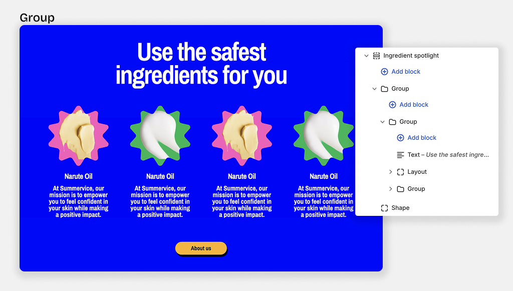
The main function of the nested Block is to create layout flex vertical or horizontal for blocks inside it.
You can add all of theme blocks to a Group block (except private blocks used for specific sections)
Group layout settings
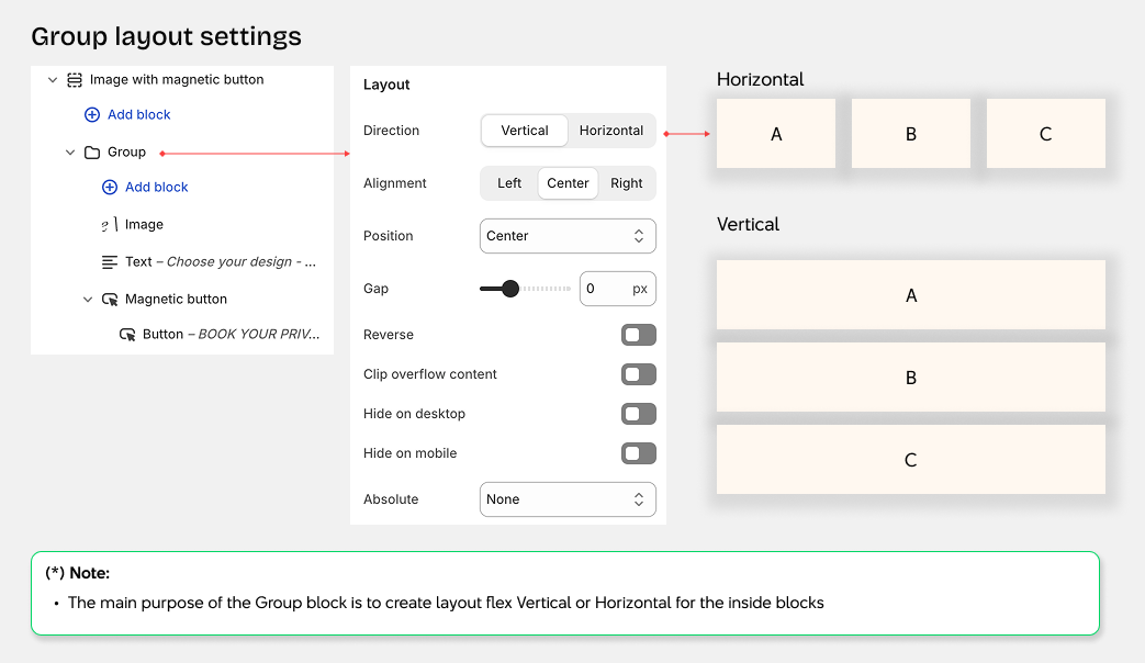
- Direction: Set the layout direction for items (vertical or horizontal)
- Horizontal alignment: Align items horizontally within the block (left, center, right)
- Vertical alignment: Align items vertically within the block (top, center, bottom, space-between)
- Gap: Set the spacing between items in the block
- Wrap items: Allow items to wrap to the next line when content exceeds the block width
- Reverse order: Reverse the display order of items in the block
- Clip overflow: Hide content that extends beyond the block boundaries
- Hide on mobile: Hide this block on mobile devices
- Absolute positioning: Position the block absolutely within its container with options for:
- Top row: left-top | center-top | right-top
- Middle row: left-center | center-center | right-center
- Bottom row: left-bottom | center-bottom | right-bottom
- Fill: Stretch to fill the entire container
Group size settings
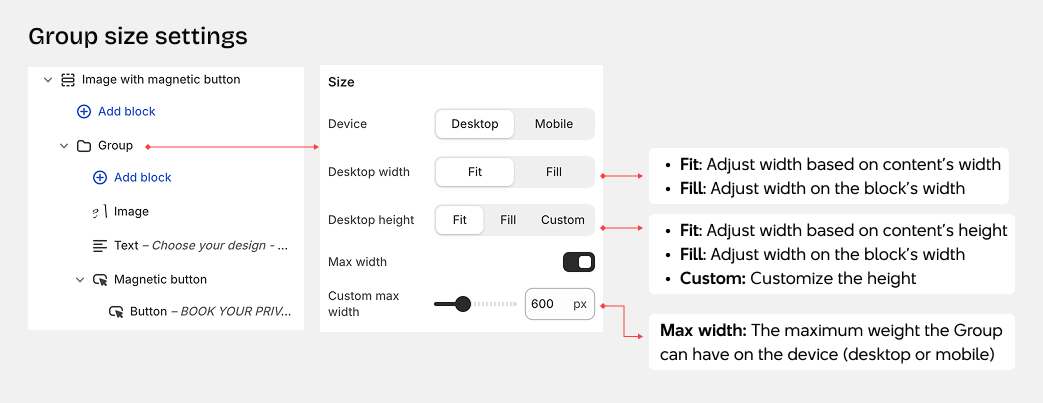
Size Settings
-
Device: Configure separate settings for desktop and mobile views
-
Width: Control how wide the block appears
- Fit content: Block automatically adjusts to match the width of its content
- Fill container: Block expands to fill the full width of its container
- Custom: Set a specific width using a percentage value
-
Height: Control how tall the block appears
- Fit content: Block automatically adjusts to match the height of its content
- Fill container: Block expands to fill the full height of its container
- Custom: Set a specific height using a percentage value
Other group settings
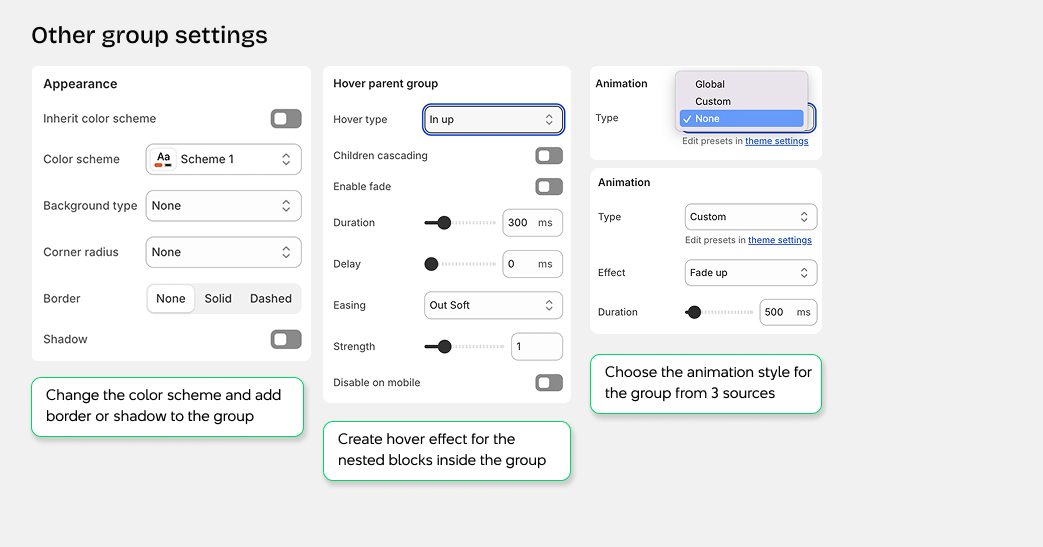
A group can have other settings as well, such as for Appearance, Hover, and Animation
Appearance
- Inherit color scheme: Use the section's color scheme, or choose a custom color scheme for this block
- Background type: Select the background style for your block
- None - No background
- Color - Solid color background
- Image - Image background
- Gradient - Gradient color background
- Video - Video background
- Corner radius: Adjust how rounded the block corners appear
- Border: Add a border around the block
- None - No border
- Dashed - Dashed line border
- Solid - Solid line border
- Shadow: Add a drop shadow effect to the block
Trigger on Parent Hover
- Enable hover effects: Create hover effects for child elements when hovering over the block group
- Hover type: Choose the animation direction for the hover effect
- in-up - Slide in from bottom
- in-down - Slide in from top
- in-left - Slide in from right
- in-right - Slide in from left
- out-up - Slide out to top
- out-down - Slide out to bottom
- out-left - Slide out to left
- out-right - Slide out to right
Animation
- Type: Choose the animation effect for this block
- None - No animation applied
- Custom - Create a custom animation with specific settings
- Animation type - Select the animation style
- Duration - Set how long the animation plays
- Delay - Set when the animation starts
- Global - Use the default animation from theme settings