Button block
Button Block
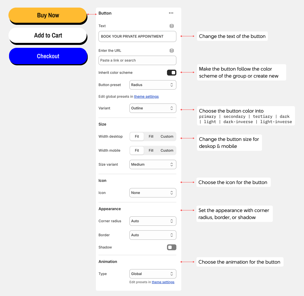
Button blocks create clickable links to other pages in your theme. Customize the text, link destination, style, and icons.
1. Button Settings
- Text: Enter the button label
- Link: Choose the destination page or URL
- Inherit color scheme: Use the section's color scheme, or apply a custom color scheme to this button
- Button style: Choose between global theme style or predefined button styles
- Variant: Select the button color variant
- Primary - Main brand color
- Secondary - Accent color
- Tertiary - Alternative color
- Dark - Dark background
- Light - Light background
- Dark-inverse - Dark text on light background
- Light-inverse - Light text on dark background
2. Typography
- Preset: Choose a preset text size that adjusts font-size, line-height, and letter-spacing based on theme settings
- Color: Change text color using theme colors or create a custom color
3. Size
- Device settings: Configure separate dimensions for desktop and mobile
- Width: Control button width
- Fit - Shrinks to fit the text
- Fill - Expands to fill available space
- Custom - Set a specific width percentage
- Max width: Set maximum button width in pixels (only applies when Width is set to Fill or Custom)
- Height: Control button height
- Auto - Adjusts automatically
- Fit - Fits to content height
- Custom - Set a specific height in pixels
4. Icon
- Icon: Choose an icon to display on the button
- Size: Set icon size from 12px to 100px
- Spacing: Adjust space between icon and text (0-50px)
- Position: Place icon on the left or right side of text
5. Absolute Positioning
- Absolute: Position the button absolutely within its container
- Top row: left-top | center-top | right-top
- Middle row: left-center | center-center | right-center
- Bottom row: left-bottom | center-bottom | right-bottom
- Fill: Stretch to fill container
6. Animation
- Type: Choose animation effect for this button
- None - No animation
- Custom - Configure animation style, duration, and delay
- Global - Use theme's default animation settings