Color swatch
Understanding color schemes
A color scheme is a set of colors that work together — backgrounds, text, buttons, borders, and accents. Wave supports multiple color schemes, so you can use different palettes for different sections of your store.
Each color scheme includes:
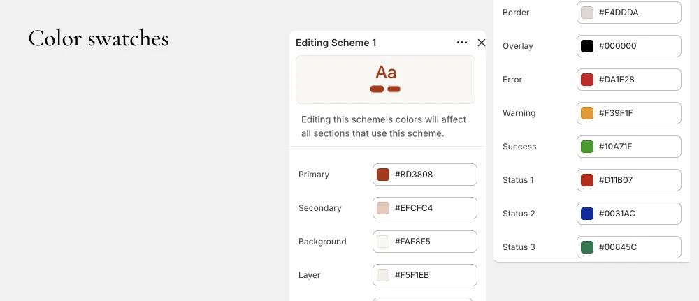
- Primary Main accent color for highlights and links
- Secondary Secondary accent color
- Tertiary Third accent color for variety
- Background Section background color (supports gradients)
- Text Primary text color
- Text 2 Secondary/lighter text color
- Button text Text color on primary buttons
- Button background Background color of primary buttons
- Button text inverse Text color on secondary buttons
- Button background inverse Background color of secondary buttons
- Layer 1 Background for cards and elevated elements
- Layer 2 Background for nested/deeper elements
- Overlay Overlay color for images and modals
- Border Default border color
- Error Error state color (e.g., form validation)
- Warning Warning state color
- Success Success state color
- Status 1, 2, 3 Additional status/badge colors
Creating and editing color schemes
- Go to Online Store > Customize > Theme settings > Colors.
- You'll see the default color schemes.
- Click on a scheme to edit its colors.
- Click Add scheme to create a new color scheme.
- Name your scheme and set each color value.
Applying color schemes to sections
Each section and many blocks have a Color scheme setting:
- Select the section or block in the theme editor.
- Find the Color scheme setting.
- Choose from your available schemes or select Inherit to use the parent's scheme.
This lets you create visual variety — for example, a dark section between light sections, or an accent-colored promotional banner.